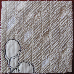
 The background is constructed with a chenille technique, cutting through several layers of fabric | 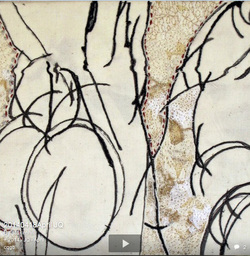 The April piece has a scrap collaged background which is machine stitched. The figures are digitally printed then stitched. |
|
0 Comments
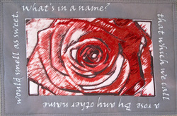 This is the second Journal Quilt of 2013, for February, continuing the theme "In other words". It is a quotation from Romeo and Juliet. "What's in a name? A rose by any other name would smell as sweet." The rose is a digital print which I enhanced with inktense pencils and then machine stitched. 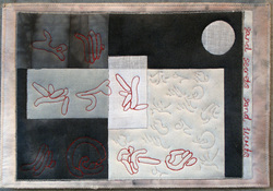 This is the March Journal Quilt, called " Sand Stories". Last March,when I was in Mevagissey, I photographed lug worm casts on the beach and it occurred to me that they looked like a kind of alphabet again. I'm not sure what the story is yet - as long as it isn't a load of ----! 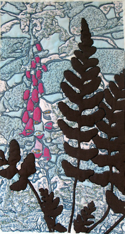 This is my take on the second "whisper", called "Foxglove". I took a photo of a stone wall and a foxglove, used filters and also changed the colour palette then printed on to recycled cotton sheet again. The background is machine stitched and the fern shapes are appliquéd on top. Areas of the wall have been embroidered with French knots in a chunky thread.
I am enjoying this idea of just looking for a brief time at an image and then taking an idea from it for a new piece of work. The original piece was quite abstract but the colour palette was similar. I spotted a wall and a fern growing at it's base. My first print turned out rather light. This was the second attempt. I shall probably resurrect the other print by adding some inktense colour to it. 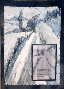 This is the last Journal Quilt of 2012 - actually finished today in my new shed. It is a mixed media piece. The background is emulsion paint, scrim and tissue - painted and machine stitched. The inset panel is a digital print with text and hand stitched. The quotation is the reason I made the piece. It is a quotation by Edith Sitwell that I was sent recently and particularly like. "Winter is the time for comfort, for good food and warmth, for the touch of a friendly hand and for a talk beside the fire: it is the time for home." 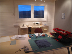 This is a view of the interior of my new studio/shed. We braved IKEA for a table yesterday and I have moved in my sewing machine. There is still lots to do - the plumbing needs finishing, electrics tweaking and the shelves and storage cupboard to kit out. It has been lovely working in there today.
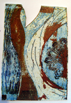 This is a print of the original collagraph on paper. I used polyfilla and pva glue drawn into and an imprint of some lace. The original has a cut out and is 8cm x 12 cm. 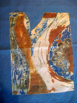 To get more blue in the design design I added a border and more blue to the design then printed onto recycled cotton. 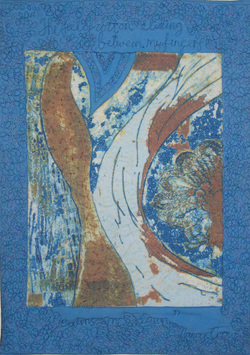 This is the finished Journal Quilt.
I machine stitched and hand stitched the background and stitched a sentence in the background. I had recently been to a lecture, given by Nancy Crow at the V and A. She was a very inspiring speaker. One thing she said really resonated with me. It is why I love fabric too, and why I particularly love stitching cloth. "The feel of cotton sliding between my fingers calms me down."  The next four journal quilts for the rest of the year have blue as their theme. I recently did a weekend collograph course with Sue Brown and the centre panel of this design is a scan of my small original card and tape print. I thought the shapes looked a bit like the ears of corn. The borders were added by using the pattern maker facility on Photoshop and then the whole printed onto recycled cotton and machine stitched.
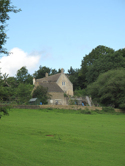 This is a photo I took of the cottage on a walk between showers the other day.The field is so wet at the moment but the rabbits have been busy and you can just see a hole. There are more than ever - holes and rabbits - which pleases the dog. I've been playing with colour and effects to come up with some ideas for the design of the July journal quilt. 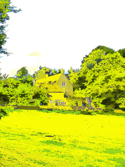 Just added some yellow, then zoomed in and used the cut out filter and reduced the colours to just six. I printed it on to some bjs treated cotton and will probably quilt it, but fancy doing a reverse applique piece as well so have just traced out the shapes and sorted out some fabric to use. 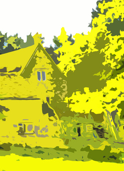 I think this has a kind of basic, block printed, fifties look. By the time its stitched I expect it won't look like a house at all.
 This is the second of the yellow series of JQ's. I find this a difficult colour, so it was quite a challenge. I love yellow in the garden best!
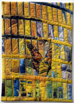
However, after a long conversation with friend outside the supermarket about life and our difficulty getting on with things sometimes( to be fair, it was raining again), I came home and started looking at some photos I'd taken on a boat trip around Bristol docks. I had a photo of office blocks which had some interesting reflections, so played with the colour and layered an image of a butterfly over the surface. I printed this on to BJS treated recycled cotton sheeting and was very surprised with the sharp print that I got. I also printed it on to transparent film - maybe another project. |
AuthorFor Blogs pre March 2012 click the link below: Archives
June 2022
Categories
All
|
 RSS Feed